Though nothing in the world beyond death and taxes is ever 100% guaranteed, the most reliable measure of assurance one can acquire relative to seeking a successful trading and investment strategy, is to observe that strategies past performance over various market cycles.
In doing so, one can then see and prudently evaluate the historical record as to how that strategy or money managers performance compared to simply buying and holding the underlying stock or index, as well as how various strategies stack up against the performance of hedge funds or other financial benchmarks such as the S&P 500 index.
What Makes the Chart Cast Pilot Unique?
The Chart Cast Pilot portfolio has several noteworthy distinctions. Firstly, the Chart Cast Pilot is an unbiased portfolio of trading and investment strategies, it is neither a newsletter nor a charting service though there are slight remnants of both in its daily dispatch.
The portfolio is updated daily, and covers six macro markets and five individual stocks. The service includes 33 proprietary trading strategies, which engage each of the 11 financial instruments in three distinct timeframes.
The service is void of hyperbole, predictions, fear mongering, or promises of implausible profits. Though replete with ample amounts technical analysis and Elliott Wave counts, the service does not dwell upon such, and most certainly does not establish official positions with such tools.
Instead, chart patterns, technical analysis, and Elliott Wave structures provide a useful visual backdrop, and assist in the programmed trading models that do establish each market-entry and position shift.
21-Year Performance Comparison Timing the S&P 500
Here’s how it Works
In each timeframe and market, the portfolio is never flat and thus always either long or short. To establish a long-term position bias, we use the underlying indices for the macro markets, and for the stock portfolio, we use long-term investment charts. We notify subscribers in advance via email alerts as well as through the daily publication dispatch as to pending position shifts for each market and timeframe. As such, subscribers are able to replicate precisely the performance of the long-term investment portfolio.
To establish and monitor mid-level trading accounts geared toward the medium-term, the portfolio uses the appropriate ETF’s for engaging the macro markets, and to trade the stock portfolio, we utilize daily trading charts. We notify subscribers one session in advance of confirmed position shift alerts for each market. As such, subscribers are able to replicate precisely the performance of the mid-level portfolio.
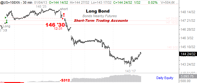
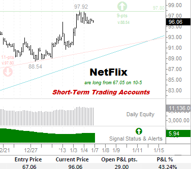
To establish and monitor short-term trading accounts, the portfolio uses the appropriate nearby futures contracts to engage the macro markets, and intraday charts to trade the short-term stock portfolio. We notify subscribers’ intraday, and one bar in advance (30-240 minutes) of pending position shift alerts for each market. As such, subscribers are able to shadow the general performance of the short-term portfolio.
Each daily dispatch includes the relevant chart and spreadsheet updates as to the ongoing performance and status for open positions within each market and timeframe.
It’s that simple, and the results, as you’ll see shortly, are rather effective. As such, there is no waiting for anticipated 3rd wave declines that never arrive, no long-winded thesis on the end of the world as we know it, no bullish or bearish table pounding, and no storytelling – all that remains are the charts and the trades, which plainly speak for themselves.
Without further ado, we present the verified record of accomplishment and trading history for the Chart Cast Pilot portfolio.
INDEX PAGE LIST
Broad Markets
· Nasdaq-100 Index (long-term)
Stocks
Medium-Term Performance
Stocks
Broad Markets
Stocks
US Dollar – Long-Term (41-year) Investment Performance 1971-2012
In each of the graphs below, the chart on the left illustrates the baseline buy & hold performance of the underlying stock or index over the period observed. Trade in the yellow shaded area (below the -0- horizontal line) represents a condition of drawdown or loss during the period, while trade amidst the green shaded area represents positive equity or profit.
In viewing the underlying performance of the dollar on the left, it is clear that apart from the extreme peak occurring in the mid-1980’s, that the US dollar has been steadily losing its value and purchasing power ever since.
In sharp contrast, the equity curve on the right represents the effects of the Chart Cast Pilot’s trading strategy effectively positioning itself both long and short amid the exact same dollar-index data points, with a dramatically different and far more profitable result than the proverbial buy and hold. Such is the immense power of a proven trading strategy that is capable of timing the market with the effective use of long and short exposures.
A good trading or investment strategy will capture profits in both downtrends and uptrend’s. Although every strategy will experience individual trading losses and monthly drawdowns, a rock solid and time-tested strategy will produce an equity graph that outperforms its underlying instrument as well as outperforming many other benchmarks in due course.
US Dollar – Medium-Term Trading Performance 2007-2012 (6-years)
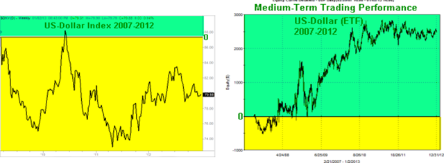
In each of the graphs below, the chart on the left illustrates the baseline buy & hold performance of the underlying stock or index over the period observed. Trade in the yellow shaded area (below the -0- horizontal line) represents a condition of drawdown or loss during the period, while trade amidst the green shaded area represents positive equity or profit.
In viewing the underlying 6-year performance of the dollar on the left, it is clear that apart from the rather brief period in June of 2010, that the US dollar has been steadily underwater (in the yellow zone) from a buy and hold perspective.
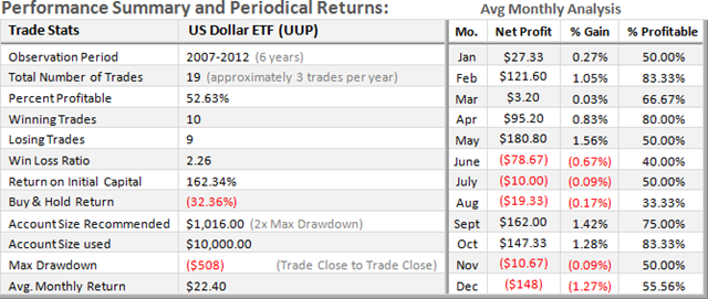
In sharp contrast, the equity curve on the right represents the effects of the Chart Cast Pilot’s trading strategy effectively positioning itself both long and short amid the exact same dollar-index data points, with a dramatically different and far more profitable result. Following the largest closed-trade drawdown of $508 in 2007, the equity graph on the right has been in profit from 2008 through 2012.
It is important to note that the equity graphs on the right depict the full extent and reality of “open-trade” drawdowns, which can be substantially greater than what is actually experienced in the maximum “closed-trade” drawdowns listed in the performance summary below.
Note the positive return on initial trading capital vs. the buy & hold performance loss of the underlying index. The average monthly return over the past six years for mid-level accounts trading the UUP was $22.40 per mo.
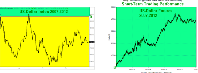
US Dollar – Short-Term Trading Performance 2007-2012 (6-years)
In each of the graphs below, the chart on the left illustrates the baseline buy & hold performance of the underlying stock or index over the period observed. Trade in the yellow shaded area (below the -0- horizontal line) represents a condition of drawdown or loss during the period, while trade amidst the green shaded area represents positive equity or profit.
In the summary below, note the volume of trades (10 per month) generated from short-term vs. medium and longer-term strategies. Furthermore, as evidenced by this strategy’s 32.22% win rate, it is important to recognize that most successful trading and investment strategies withstand a substantially greater percentage of losing vs. winning trades.
Note that although generally derived from the largest maximum drawdown, it is prudent to calculate the minimum account size required to trade a given strategy as double that amount to mitigate the probability of ruin.
The average monthly return over the past six years for short-term accounts trading nearby dollar futures contracts was $473.25 per mo.
S&P 500 – Long-Term (52-year) Investment Performance 1960-2012
In each of the graphs below, the chart on the left illustrates the baseline buy & hold performance of the underlying stock or index over the period observed. Trade in the yellow shaded area (below the -0- horizontal line) represents a condition of drawdown or loss during the period, while trade amidst the green shaded area represents positive equity or profit.
In viewing the 52-year underlying performance of the S&P on the left, it is clear that following its irrational parabolic 6-year rocket-launch rise from 1994-2000; the benchmark has suffered from two cataclysmic bear markets. These two existential events, which in reality marked the unequivocal failure of the financial system, have created a lost decade and stagnation in which the market continues to struggle on the artificial life support of the power elites who cling to their coveted monopoly control of money and credit.
In sharp contrast, the equity curve on the right represents the effects of the Chart Cast Pilot’s trading strategy effectively positioning itself both long and short amid the exact same S&P-500 data points. Our long-term investment performance illustrates a dramatically different and far more stable and progressive result than the Wild West rollercoaster ride produced by the proverbial buy and hold for the long-haul paradigm aggressively sold to the public.
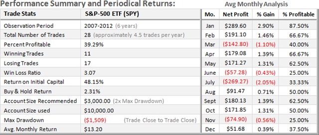
S&P 500 – Medium-Term Trading Performance 2007-2012 (6-years)
In each of the graphs below, the chart on the left illustrates the baseline buy & hold performance of the underlying stock or index over the period observed. Trade in the yellow shaded area (below the -0- horizontal line) represents a condition of drawdown or loss during the period, while trade amidst the green shaded area represents positive equity or profit.
In viewing the underlying 6-year performance of the S&P on the left, it is clear that the benchmark is struggling to maintain trade in the green profit zone, and is barely above the breakeven horizontal -0- line dividing it from the yellow loss zone.
In contrast, despite moving sideways since 2009, the equity curve on the right represent the superior effects of the Chart Cast Pilot’s trading strategy effectively positioning itself both long and short amid the exact same benchmark data points, with a dramatically different and far more profitable result. Following the largest closed-trade drawdown of $1,509 in 2007, the equity graph on the right has been in profit from 2009 through 2012.
Note the level of return on initial trading capital vs. the buy & hold performance of the underlying index. The average monthly return over the past six years for mid-level accounts trading the SPY was $13.20 per mo.
S&P 500 – Short-Term Trading Performance 2007-2012 (6-years)
In each of the graphs below, the chart on the left illustrates the baseline buy & hold performance of the underlying stock or index over the period observed. Trade in the yellow shaded area (below the -0- horizontal line) represents a condition of drawdown or loss during the period, while trade amidst the green shaded area represents positive equity or profit.
In the summary below, note the volume of trades (14 per month) generated from short-term vs. medium and longer-term strategies. Furthermore, as evidenced by this strategy’s 32.39% win rate, it is important to recognize that most successful trading and investment strategies withstand a substantially greater percentage of losing vs. winning trades.
Note that although generally derived from the largest maximum drawdown, it is prudent to calculate the minimum account size required to trade a given strategy as double that amount to mitigate the probability of ruin.
The average monthly return over the past six years for short-term accounts trading nearby S&P futures contracts was $629.38 per mo.
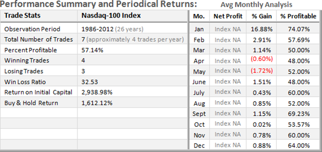
NDX 100 – Long-Term (26-year) Investment Performance 1986-2012
In each of the graphs below, the chart on the left illustrates the baseline buy & hold performance of the underlying stock or index over the period observed. Trade in the yellow shaded area (below the -0- horizontal line) represents a condition of drawdown or loss during the period, while trade amidst the green shaded area represents positive equity or profit.
In viewing the 26-year underlying performance of the NDX on the left, it is clear that following the 89% crash from its irrational peak in 2000, the index has yet to recover its former highs.
In sharp contrast, the equity curve on the right represents the effects of the Chart Cast Pilot’s trading strategy effectively positioning itself both long and short amid the exact same NDX-100 data points.
Note how our strategy follows the first twelve years of irrational exuberance including the initial downdraft following the crest in early 2000. However, in the next 12-years spanning from 2000 through 2012, the investment strategies equity graph on the right has clearly exceeded its prior peak equity, while the NDX still struggles near its 50% retracement level.
NDX 100 – Medium-Term Trading Performance 2007-2012 (6-years)
In each of the graphs below, the chart on the left illustrates the baseline buy & hold performance of the underlying stock or index over the period observed. Trade in the yellow shaded area (below the -0- horizontal line) represents a condition of drawdown or loss during the period, while trade amidst the green shaded area represents positive equity or profit.
Given the exceptional and consistent one directional rise in the underlying NDX index from its bear market low in 2009, and when accounting for slippage and commission costs, our equity graph on the right along with the trade stats below shows only a modest margin of outperformance (with greater volatility) relative to a purely passive buy and hold strategy.
Note the level of return on initial trading capital vs. the buy & hold performance of the underlying index. The average monthly return over the past six years for mid-level accounts trading the QQQ was $11.27 per mo.
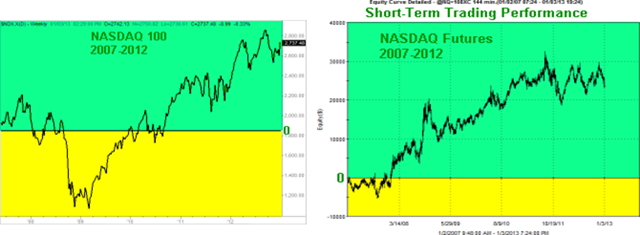
NDX 100 – Short-Term Trading Performance 2007-2012 (6-years)
In each of the graphs below, the chart on the left illustrates the baseline buy & hold performance of the underlying stock or index over the period observed. The equity chart on the right represent the effects of the Chart Cast Pilot’s trading strategy positioning itself both long and short amid the exact same data points. Trade in the yellow shaded area (below the -0- horizontal lines) represents a condition of drawdown or loss during the period, while trade within the green shaded area represents positive equity or profit.
Note that the equity graphs on the right depict the full extent and reality of “open-trade” drawdowns, which can be substantially greater than that which is actually experienced in the maximum “closed-trade” drawdowns listed in the performance summary below. The “Avg. Monthly Analysis” section of the summary illustrates each month’s average performance over the observation period.
Note that although generally derived from the largest maximum drawdown, it is prudent to calculate the minimum account size required to trade a given strategy as double that amount to mitigate the probability of ruin.
The average monthly return over the past six years for short-term accounts trading nearby NDX futures contracts was $224.75 per mo.
GOLD – Long-Term (37-year) Investment Performance 1975-2012
In each of the graphs below, the chart on the left illustrates the baseline buy & hold performance of the underlying stock or index over the period observed. Trade in the yellow shaded area (below the -0- horizontal line) represents a condition of drawdown or loss during the period, while trade amidst the green shaded area represents positive equity or profit.
The long-term investment performance over the 37-year observation period (right) is at first glance very similar to the underlying performance of Gold itself, which is represented at the left. There are three general differences of note. The first is Gold’s baseline dip into the yellow drawdown zone at the start of the period, whereas the investment strategy was able to avoid such fate.
The second distinction rests with the trajectory of Gold’s 20-year bear market spanning from 1980 through 2000. Gold’s underlying performance is clearly heading down in this period reaching a secular low in the year 2000.
In contrast, the investment performance during this 20-year period, though sideways, does not result in producing a proportionate equity low in the year 2000. Lastly, since peaking in 2011, the underlying price of Gold has thus far outperformed the investment strategy.
GOLD – Medium-Term Trading Performance 2007-2012 (6-years)
In each of the graphs below, the chart on the left illustrates the baseline buy & hold performance of the underlying stock or index over the period observed. Trade in the yellow shaded area (below the -0- horizontal line) represents a condition of drawdown or loss during the period, while trade amidst the green shaded area represents positive equity or profit.
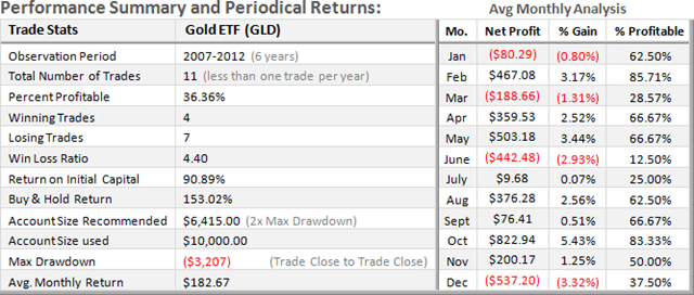
Given the exceptional and consistent one directional rise in the underlying Gold Price since 2007, our equity graph on the right along with the trade stats below shows that in this instance, a buy & hold strategy outperformed our strategies efforts to outfox the price action.
Note the level of return on initial trading capital vs. the buy & hold performance of the underlying index. The average monthly return over the past six years for mid-level accounts trading the GLD was $182.67 per mo.
GOLD – Short-Term Trading Performance 2007-2012 (6-years)
In each of the graphs below, the chart on the left illustrates the baseline buy & hold performance of the underlying stock or index over the period observed. The equity chart on the right represent the effects of the Chart Cast Pilot’s trading strategy positioning itself both long and short amid the exact same data points. Trade in the yellow shaded area (below the -0- horizontal lines) represents a condition of drawdown or loss during the period, while trade within the green shaded area represents positive equity or profit.
Note that the equity graphs on the right depict the full extent and reality of “open-trade” drawdowns, which can be substantially greater than that which is actually experienced in the maximum “closed-trade” drawdowns listed in the performance summary below. The “Avg. Monthly Analysis” section of the summary illustrates each month’s average performance over the observation period.
Note that although generally derived from the largest maximum drawdown, it is prudent to calculate the minimum account size required to trade a given strategy as double that amount to mitigate the probability of ruin.
The average monthly return over the past six years for short-term accounts trading nearby GOLD futures contracts was $976.50 per mo.
OIL – Long-Term (14-year) Investment Performance 1998-2012
In each of the graphs below, the chart on the left illustrates the baseline buy & hold performance of the underlying stock or index over the period observed. The equity chart on the right represent the effects of the Chart Cast Pilot’s trading strategy positioning itself both long and short amid the exact same data points. Trade in the yellow shaded area (below the -0- horizontal lines) represents a condition of drawdown or loss during the period, while trade within the green shaded area represents positive equity or profit.
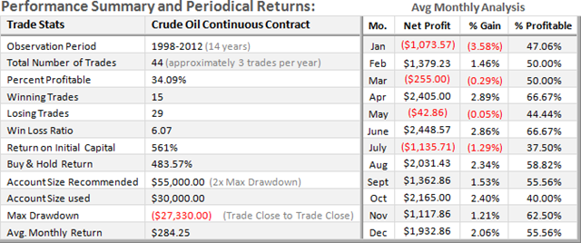
Note that the equity graphs on the right depict the full extent and reality of “open-trade” drawdowns, which can be substantially greater than that which is actually experienced in the maximum “closed-trade” drawdowns listed in the performance summary below. The “Avg. Monthly Analysis” section of the summary illustrates each month’s average performance over the observation period.
Note that although generally derived from the largest maximum drawdown, it is prudent to calculate the minimum account size required to trade a given strategy as double that amount to mitigate the probability of ruin.
The average monthly return over the past 23 years for long-term accounts trading nearby Oil futures contracts was $284.25 per mo.
OIL – Medium-Term Trading Performance 2007-2012 (6-years)
In each of the graphs below, the chart on the left illustrates the baseline buy & hold performance of the underlying stock or index over the period observed. The equity chart on the right represent the effects of the Chart Cast Pilot’s trading strategy positioning itself both long and short amid the exact same data points. Trade in the yellow shaded area (below the -0- horizontal lines) represents a condition of drawdown or loss during the period, while trade within the green shaded area represents positive equity or profit.
Note that the equity graphs on the right depict the full extent and reality of “open-trade” drawdowns, which can be substantially greater than that which is actually experienced in the maximum “closed-trade” drawdowns listed in the performance summary below. The “Avg. Monthly Analysis” section of the summary illustrates each month’s average performance over the observation period.
Note the level of return on initial trading capital vs. the buy & hold performance of the underlying index. The average monthly return over the past six years for mid-level accounts trading the USO was $42.56 per mo..
OIL – Short-Term Trading Performance 2007-2012 (6-years)
In each of the graphs below, the chart on the left illustrates the baseline buy & hold performance of the underlying stock or index over the period observed. The equity chart on the right represent the effects of the Chart Cast Pilot’s trading strategy positioning itself both long and short amid the exact same data points. Trade in the yellow shaded area (below the -0- horizontal lines) represents a condition of drawdown or loss during the period, while trade within the green shaded area represents positive equity or profit.
Note that the equity graphs on the right depict the full extent and reality of “open-trade” drawdowns, which can be substantially greater than that which is actually experienced in the maximum “closed-trade” drawdowns listed in the performance summary below. The “Avg. Monthly Analysis” section of the summary illustrates each month’s average performance over the observation period.
Note that although generally derived from the largest maximum drawdown, it is prudent to calculate the minimum account size required to trade a given strategy as double that amount to mitigate the probability of ruin.
The average monthly return over the past six years for short-term accounts trading nearby OIL futures contracts was $1,783.50 per mo..
Bonds – Long-Term (35-year) Investment Performance 1977-2012
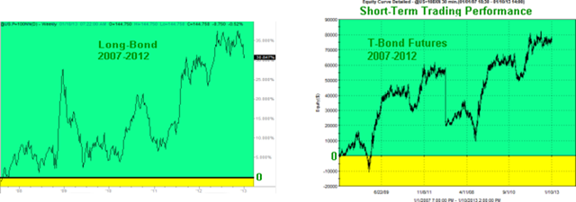
In each of the graphs below, the chart on the left illustrates the baseline buy & hold performance of the underlying stock or index over the period observed. The equity chart on the right represent the effects of the Chart Cast Pilot’s trading strategy positioning itself both long and short amid the exact same data points. Trade in the yellow shaded area (below the -0- horizontal lines) represents a condition of drawdown or loss during the period, while trade within the green shaded area represents positive equity or profit.
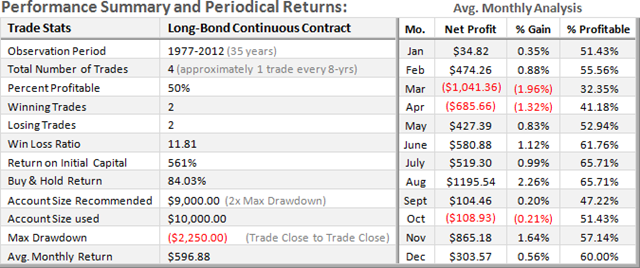
Note that the equity graphs on the right depict the full extent and reality of “open-trade” drawdowns, which can be substantially greater than that which is actually experienced in the maximum “closed-trade” drawdowns listed in the performance summary below. The “Avg. Monthly Analysis” section of the summary illustrates each month’s average performance over the observation period.
Note that although generally derived from the largest maximum drawdown, it is prudent to calculate the minimum account size required to trade a given strategy as double that amount to mitigate the probability of ruin.
The average monthly return over the past 35 years for long-term accounts trading nearby Long Bond futures contracts was $596.88 per mo..
< 2007-2012 Performance Trading Medium-Term – Bonds>
In each of the graphs below, the chart on the left illustrates the baseline buy & hold performance of the underlying stock or index over the period observed. The equity chart on the right represent the effects of the Chart Cast Pilot’s trading strategy positioning itself both long and short amid the exact same data points. Trade in the yellow shaded area (below the -0- horizontal lines) represents a condition of drawdown or loss during the period, while trade within the green shaded area represents positive equity or profit.
Note that the equity graphs on the right depict the full extent and reality of “open-trade” drawdowns, which can be substantially greater than that which is actually experienced in the maximum “closed-trade” drawdowns listed in the performance summary below. The “Avg. Monthly Analysis” section of the summary illustrates each month’s average performance over the observation period.
Note the level of return on initial trading capital vs. the buy & hold performance of the underlying index. The average monthly return over the past six years for mid-level accounts trading the TLT was $58.91 per mo..
Bonds – Short-Term Trading Performance 2007-2012 (6-years)
In each of the graphs below, the chart on the left illustrates the baseline buy & hold performance of the underlying stock or index over the period observed. The equity chart on the right represent the effects of the Chart Cast Pilot’s trading strategy positioning itself both long and short amid the exact same data points. Trade in the yellow shaded area (below the -0- horizontal lines) represents a condition of drawdown or loss during the period, while trade within the green shaded area represents positive equity or profit.
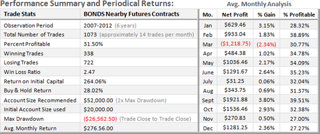
Note that the equity graphs on the right depict the full extent and reality of “open-trade” drawdowns, which can be substantially greater than that which is actually experienced in the maximum “closed-trade” drawdowns listed in the performance summary below. The “Avg. Monthly Analysis” section of the summary illustrates each month’s average performance over the observation period.
Note that although generally derived from the largest maximum drawdown, it is prudent to calculate the minimum account size required to trade a given strategy as double that amount to mitigate the probability of ruin.
The average monthly return over the past six years for short-term accounts trading nearby Bond futures contracts was $276.56 per mo..
APPLE – Long-Term (32-year) Investment Performance 1980-2012
In each of the graphs below, the chart on the left illustrates the baseline buy & hold performance of the underlying stock or index over the period observed. The equity chart on the right represent the effects of the Chart Cast Pilot’s trading strategy positioning itself both long and short amid the exact same data points. Trade in the yellow shaded area (below the -0- horizontal lines) represents a condition of drawdown or loss during the period, while trade within the green shaded area represents positive equity or profit.
Note that the equity graphs on the right depict the full extent and reality of “open-trade” drawdowns, which can be substantially greater than that which is actually experienced in the maximum “closed-trade” drawdowns listed in the performance summary below. The “Avg. Monthly Analysis” section of the summary illustrates each month’s average performance over the observation period.
The average monthly return over the past 32-years for long-term investment accounts trading AAPL was $18,458.98 per mo..
APPLE – Medium-Term Trading Performance 2007-2012 (6-years)
In each of the graphs below, the chart on the left illustrates the baseline buy & hold performance of the underlying stock or index over the period observed. The equity chart on the right represent the effects of the Chart Cast Pilot’s trading strategy positioning itself both long and short amid the exact same data points. Trade in the yellow shaded area (below the -0- horizontal lines) represents a condition of drawdown or loss during the period, while trade within the green shaded area represents positive equity or profit.
Note that the equity graphs on the right depict the full extent and reality of “open-trade” drawdowns, which can be substantially greater than that which is actually experienced in the maximum “closed-trade” drawdowns listed in the performance summary below. The “Avg. Monthly Analysis” section of the summary illustrates each month’s average performance over the observation period.
The average monthly return over the past six years for mid-level accounts trading AAPL was $1,028 per mo..
APPLE – Short-Term Trading Performance 2007-2012 (6-years)
In each of the graphs below, the chart on the left illustrates the baseline buy & hold performance of the underlying stock or index over the period observed. The equity chart on the right represent the effects of the Chart Cast Pilot’s trading strategy positioning itself both long and short amid the exact same data points. Trade in the yellow shaded area (below the -0- horizontal lines) represents a condition of drawdown or loss during the period, while trade within the green shaded area represents positive equity or profit.
Note that the equity graphs on the right depict the full extent and reality of “open-trade” drawdowns, which can be substantially greater than that which is actually experienced in the maximum “closed-trade” drawdowns listed in the performance summary below. The “Avg. Monthly Analysis” section of the summary illustrates each month’s average performance over the observation period.
Note that although generally derived from the largest maximum drawdown, it is prudent to calculate the minimum account size required to trade a given strategy as double that amount to mitigate the probability of ruin.
The average monthly return over the past six years for short-term accounts trading AAPL was $1,008.72 per mo..
GOOGLE – Long-Term (9-year) Investment Performance 2004-2012
In each of the graphs below, the chart on the left illustrates the baseline buy & hold performance of the underlying stock or index over the period observed. The equity chart on the right represent the effects of the Chart Cast Pilot’s trading strategy positioning itself both long and short amid the exact same data points. Trade in the yellow shaded area (below the -0- horizontal lines) represents a condition of drawdown or loss during the period, while trade within the green shaded area represents positive equity or profit.
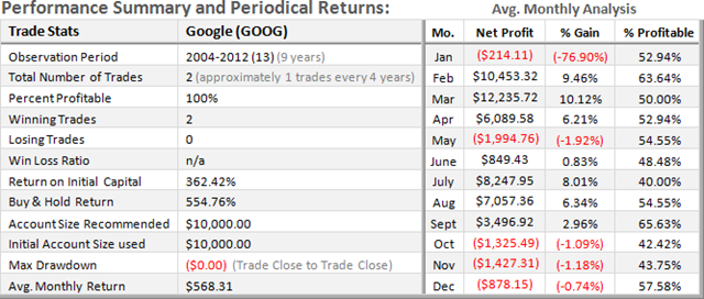
Note that the equity graphs on the right depict the full extent and reality of “open-trade” drawdowns, which can be substantially greater than that which is actually experienced in the maximum “closed-trade” drawdowns listed in the performance summary below. The “Avg. Monthly Analysis” section of the summary illustrates each month’s average performance over the observation period.
The average monthly return over the past 9-years for long-term investment accounts trading GOOG was $568.31 per mo..
GOOGLE – Medium-Term Trading Performance 2007-2012 (6-years)
In each of the graphs below, the chart on the left illustrates the baseline buy & hold performance of the underlying stock or index over the period observed. The equity chart on the right represent the effects of the Chart Cast Pilot’s trading strategy positioning itself both long and short amid the exact same data points. Trade in the yellow shaded area (below the -0- horizontal lines) represents a condition of drawdown or loss during the period, while trade within the green shaded area represents positive equity or profit.
Note that the equity graphs on the right depict the full extent and reality of “open-trade” drawdowns, which can be substantially greater than that which is actually experienced in the maximum “closed-trade” drawdowns listed in the performance summary below. The “Avg. Monthly Analysis” section of the summary illustrates each month’s average performance over the observation period.
The average monthly return over the past six years for mid-level accounts trading GOOG was $84.60 per mo..
GOOGLE – Short-Term Trading Performance 2007-2012 (6-years)
In each of the graphs below, the chart on the left illustrates the baseline buy & hold performance of the underlying stock or index over the period observed. The equity chart on the right represent the effects of the Chart Cast Pilot’s trading strategy positioning itself both long and short amid the exact same data points. Trade in the yellow shaded area (below the -0- horizontal lines) represents a condition of drawdown or loss during the period, while trade within the green shaded area represents positive equity or profit.
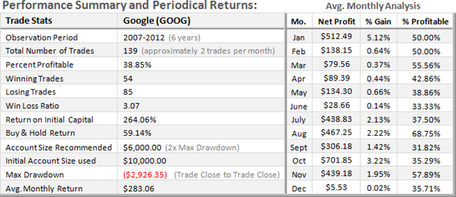
Note that the equity graphs on the right depict the full extent and reality of “open-trade” drawdowns, which can be substantially greater than that which is actually experienced in the maximum “closed-trade” drawdowns listed in the performance summary below. The “Avg. Monthly Analysis” section of the summary illustrates each month’s average performance over the observation period.
Note that although generally derived from the largest maximum drawdown, it is prudent to calculate the minimum account size required to trade a given strategy as double that amount to mitigate the probability of ruin.
The average monthly return over the past six years for short-term accounts trading GOOG was $283.06 per mo..
NETFLIX – Long-Term (11-year) Investment Performance 2002-2012
In each of the graphs below, the chart on the left illustrates the baseline buy & hold performance of the underlying stock or index over the period observed. The equity chart on the right represent the effects of the Chart Cast Pilot’s trading strategy positioning itself both long and short amid the exact same data points. Trade in the yellow shaded area (below the -0- horizontal lines) represents a condition of drawdown or loss during the period, while trade within the green shaded area represents positive equity or profit.
Note that the equity graphs on the right depict the full extent and reality of “open-trade” drawdowns, which can be substantially greater than that which is actually experienced in the maximum “closed-trade” drawdowns listed in the performance summary below. The “Avg. Monthly Analysis” section of the summary illustrates each month’s average performance over the observation period.
The average monthly return over the past 11-years for long-term investment accounts trading NFLX was $7,760.73 per mo.
NETFLIX – Medium-Term Trading Performance 2007-2012 (6-years)
In each of the graphs below, the chart on the left illustrates the baseline buy & hold performance of the underlying stock or index over the period observed. The equity chart on the right represent the effects of the Chart Cast Pilot’s trading strategy positioning itself both long and short amid the exact same data points. Trade in the yellow shaded area (below the -0- horizontal lines) represents a condition of drawdown or loss during the period, while trade within the green shaded area represents positive equity or profit.
Note that the equity graphs on the right depict the full extent and reality of “open-trade” drawdowns, which can be substantially greater than that which is actually experienced in the maximum “closed-trade” drawdowns listed in the performance summary below. The “Avg. Monthly Analysis” section of the summary illustrates each month’s average performance over the observation period.
The average monthly return over the past six years for mid-level accounts trading NFLX was $4,017.02 per mo.
NETFLIX – Short-Term Trading Performance 2007-2012 (6-years)
In each of the graphs below, the chart on the left illustrates the baseline buy & hold performance of the underlying stock or index over the period observed. The equity chart on the right represent the effects of the Chart Cast Pilot’s trading strategy positioning itself both long and short amid the exact same data points. Trade in the yellow shaded area (below the -0- horizontal lines) represents a condition of drawdown or loss during the period, while trade within the green shaded area represents positive equity or profit.
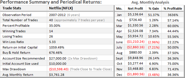
Note that the equity graphs on the right depict the full extent and reality of “open-trade” drawdowns, which can be substantially greater than that which is actually experienced in the maximum “closed-trade” drawdowns listed in the performance summary below. The “Avg. Monthly Analysis” section of the summary illustrates each month’s average performance over the observation period.
Note that although generally derived from the largest maximum drawdown, it is prudent to calculate the minimum account size required to trade a given strategy as double that amount to mitigate the probability of ruin.
The average monthly return over the past six years for short-term accounts trading NFLX was $3,761.28 per mo..
AMAZON – Long-Term (15-year) Investment Performance 1997-2012
In each of the graphs below, the chart on the left illustrates the baseline buy & hold performance of the underlying stock or index over the period observed. The equity chart on the right represent the effects of the Chart Cast Pilot’s trading strategy positioning itself both long and short amid the exact same data points. Trade in the yellow shaded area (below the -0- horizontal lines) represents a condition of drawdown or loss during the period, while trade within the green shaded area represents positive equity or profit.
Note that the equity graphs on the right depict the full extent and reality of “open-trade” drawdowns, which can be substantially greater than that which is actually experienced in the maximum “closed-trade” drawdowns listed in the performance summary below. The “Avg. Monthly Analysis” section of the summary illustrates each month’s average performance over the observation period.
The average monthly return over the past 15-years for long-term investment accounts trading AMZN was $7,197.83 per mo..
AMAZON – Medium-Term Trading Performance 2007-2012 (6-years))
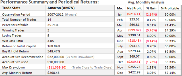
In each of the graphs below, the chart on the left illustrates the baseline buy & hold performance of the underlying stock or index over the period observed. The equity chart on the right represent the effects of the Chart Cast Pilot’s trading strategy positioning itself both long and short amid the exact same data points. Trade in the yellow shaded area (below the -0- horizontal lines) represents a condition of drawdown or loss during the period, while trade within the green shaded area represents positive equity or profit.
Note that the equity graphs on the right depict the full extent and reality of “open-trade” drawdowns, which can be substantially greater than that which is actually experienced in the maximum “closed-trade” drawdowns listed in the performance summary below. The “Avg. Monthly Analysis” section of the summary illustrates each month’s average performance over the observation period.
The average monthly return over the past six years for mid-level accounts trading AMZN was $268.45 per mo..
AMAZON – Short-Term Trading Performance 2007-2012 (6-years)
In each of the graphs below, the chart on the left illustrates the baseline buy & hold performance of the underlying stock or index over the period observed. The equity chart on the right represent the effects of the Chart Cast Pilot’s trading strategy positioning itself both long and short amid the exact same data points. Trade in the yellow shaded area (below the -0- horizontal lines) represents a condition of drawdown or loss during the period, while trade within the green shaded area represents positive equity or profit.
Note that the equity graphs on the right depict the full extent and reality of “open-trade” drawdowns, which can be substantially greater than that which is actually experienced in the maximum “closed-trade” drawdowns listed in the performance summary below. The “Avg. Monthly Analysis” section of the summary illustrates each month’s average performance over the observation period.
Note that although generally derived from the largest maximum drawdown, it is prudent to calculate the minimum account size required to trade a given strategy as double that amount to mitigate the probability of ruin.
The average monthly return over the past six years for short-term accounts trading AMZN was $581.47 per mo.
CATERPILLAR – Long-Term (22-year) Investment Performance 1990-2012
In each of the graphs below, the chart on the left illustrates the baseline buy & hold performance of the underlying stock or index over the period observed. The equity chart on the right represent the effects of the Chart Cast Pilot’s trading strategy positioning itself both long and short amid the exact same data points. Trade in the yellow shaded area (below the -0- horizontal lines) represents a condition of drawdown or loss during the period, while trade within the green shaded area represents positive equity or profit.
Note that the equity graphs on the right depict the full extent and reality of “open-trade” drawdowns, which can be substantially greater than that which is actually experienced in the maximum “closed-trade” drawdowns listed in the performance summary below. The “Avg. Monthly Analysis” section of the summary illustrates each month’s average performance over the observation period.
The average monthly return over the past 22-years for long-term investment accounts trading CAT was $662.53 per mo..
CATERPILLAR – Medium-Term Trading Performance 2007-2012 (6-years)
In each of the graphs below, the chart on the left illustrates the baseline buy & hold performance of the underlying stock or index over the period observed. The equity chart on the right represent the effects of the Chart Cast Pilot’s trading strategy positioning itself both long and short amid the exact same data points. Trade in the yellow shaded area (below the -0- horizontal lines) represents a condition of drawdown or loss during the period, while trade within the green shaded area represents positive equity or profit.
Note that the equity graphs on the right depict the full extent and reality of “open-trade” drawdowns, which can be substantially greater than that which is actually experienced in the maximum “closed-trade” drawdowns listed in the performance summary below. The “Avg. Monthly Analysis” section of the summary illustrates each month’s average performance over the observation period.
The average monthly return over the past six years for mid-level accounts trading CAT was $177.37 per mo..
CATERPILLAR – Short-Term Trading Performance 2007-2012 (6-years)
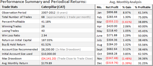
In each of the graphs below, the chart on the left illustrates the baseline buy & hold performance of the underlying stock or index over the period observed. The equity chart on the right represent the effects of the Chart Cast Pilot’s trading strategy positioning itself both long and short amid the exact same data points. Trade in the yellow shaded area (below the -0- horizontal lines) represents a condition of drawdown or loss during the period, while trade within the green shaded area represents positive equity or profit.
Note that the equity graphs on the right depict the full extent and reality of “open-trade” drawdowns, which can be substantially greater than that which is actually experienced in the maximum “closed-trade” drawdowns listed in the performance summary below. The “Avg. Monthly Analysis” section of the summary illustrates each month’s average performance over the observation period.
Note that although generally derived from the largest maximum drawdown, it is prudent to calculate the minimum account size required to trade a given strategy as double that amount to mitigate the probability of ruin.
The average monthly return over the past six years for short-term accounts trading CAT was $179.89 per mo.
![SPX-long-term-COMPS-1991-2013_thumb2[1] SPX-long-term-COMPS-1991-2013_thumb2[1]](https://blogger.googleusercontent.com/img/b/R29vZ2xl/AVvXsEjCijcAU0EKenxKKzoTe2faENdZWAkC4bm8Q2cLdz5LXPdFQP29CkmMndHhkyQlTlejixmFjs74W8ifjQ27jNlABo86QURRwS9Klcn8ipIFN-LeuBX4R9hDpNlJ7Hg12coPcLzG78_p2unB/?imgmax=800)


